

Homnox
Homnox is a B2C online marketplace where users can
build, furnish and buy a 3D-printed home.
Problem
The 3D home printing industry is experiencing significant growth. Nonetheless, due to the industry's relative novelty, consumers encounter challenges comprehending the process of construction and acquiring a 3D-printed home.
The Homnox website does not currently resolve these issues, so there is a need to re-imagine its website design and implement a clear user-friendly layout throughout the platform.
Solution
Our team created a user-friendly online platform that simplifies the process of buying a 3D-printed house and provides accessible resources for consumers. This platform features a step-by-step guide on designing and printing 3D objects, as well as a presentation of reliable financing and furnishing services. By implementing this solution, consumers will be better equipped to navigate the 3D printing industry and confidently procure the 3D-printed homes they desire.
Tools
-
Figma
-
Figjam
-
Zoom
Role
-
UX/UI Designer in a team of 5
Process
-
Agile
Duration
-
6 weeks


1. Discovery
1.01 Heuristic Evaluation
Before proceeding with re-designing the existing website, the team performed a heuristic evaluation and noted things that need to be addressed:
-
The website uses an inconsistent design that lacks aesthetic appeal, which can be overwhelming and confusing for users.
-
The website uses technical terms that may not be familiar to the average user. This can make it difficult for users to understand the features the business provides and find the information they need.
-
The use of fictional images on the "About Us" page instead of authentic photographs of team members can result in decreased trust from users.
Original Homnox Website:

Home Page

About Us Page

Home Page

About Us Page
1.02 Competitive Analysis
To enhance the user experience, the team explored various competitor home construction websites, including those of 3D home printing companies and traditional construction websites. Our aim was to identify successful and unsuccessful approaches and draw inspiration for the UI design.
We observed that:
-
the majority of websites adopt a design layout that is clear and simple to follow.
-
This layout usually includes a combination of white space, typography, and images that are well-balanced.
-
The white space aids in separating the content, which enhances its readability and allows for efficient scanning.
-
Furthermore, the website's overall appearance is often described as modern, polished, and dynamic, which is largely achieved by the use of vivid and lively colors.


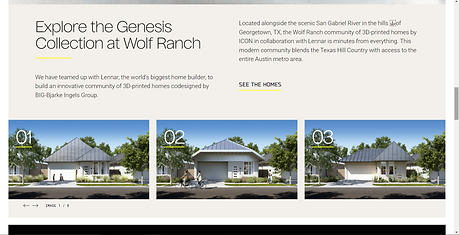
mira.world


mira.world
2. Ideation
2.01 User Stories
Upon receiving the client's User Stories, our team analyzed the primary objectives that the client wanted their users to accomplish. We evaluated each objective and created 7 different User Flows.
As a user, I want to...
-
As a user, I want to explore my financing options.
-
As a user, I want to understand how I am able to furnish my Homonox home.
-
As a user, I want to learn how to Build my Homnox home
-
As a user, I want to be able to learn the technology behind 3D House construction.
-
As a user, I want to be able to create a profile and log in to my profile from the homepage.
-
As a user, I want to be able to learn about the Homnox company.
-
As a user, I want to be able to contact Homnox representatives.
2.02 User Flows
Creating User Flows enabled us to arrange the order of screens and establish a seamless navigation experience for completing important tasks. By presenting the user experience in an orderly and explicit manner, we ensured that the end product was user-friendly and easy to use.
.png)
.png)
.png)
.png)
.png)
.png)
.png)
2.03 Lo-Fi Wireframes
Following our research and data collection, we produced Lo-Fi Wireframes. Each member of the team created Wireframes for different pages of the website. My responsibility was to design a Home Page. We then held a design session to exchange thoughts and ideas. Finally, after going through several rounds of iterations we generated our final Low-Fidelity Wireframes and presented them to the client.

.png)

Home Page Version 3
Home Page Version 2
Home Page Version 1
3. Design
3.01 Moodboard
Developing a Moodboard proved to be beneficial in determining the project's visual direction and aesthetics for the 3D construction website. The Moodboard comprised images of various architectural websites and elements such as website headers, team presentations, and contact forms. To create our Moodboard, we searched for screens on various websites including mira.world, iconbuild.com, apple.com, and dribbble.com.
The design team utilized the Moodboard as a reference to ensure the website's visual components aligned with the client's vision and objectives.


3.02 Color Exploration
To select the most suitable color for the platform we conducted a Color Exploration. Each team member presented their versions of colors they thought would be suitable for the Homnox website.
After researching and testing various colors, I ultimately decided on green as the primary color for the website. Green conveys a sense of growth, balance, and stability, which aligns with the construction industry's values. Additionally, green is known to have a calming effect, which can positively impact the user experience on the website.
Ultimately, we submitted the three strongest choices to the client, who then selected Color 3 for implementation.
Color 1
.png)
Color 2

Color 3 (mine)
3.03 Style Guide
The primary purpose of this style guide is to communicate a contemporary and forward-thinking brand identity that emphasizes the display of 3D renderings of construction projects.
The green color scheme reflects the company's sense of growth, balance, and stability, while the use of clean and uncomplicated design elements ensures a user-friendly experience.
To maintain a consistent theme throughout the User Interface, we incorporated the concept of "home" across various elements such as imagery, color choices, and verbiage.


.png)
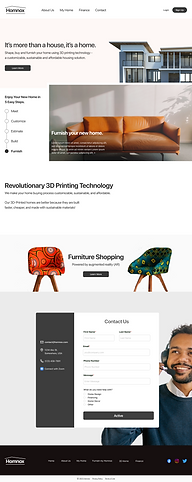
3.04 Hi-Fi Wireframes
After establishing Homnox's Style Guide, we began crafting High-Fidelity Wireframes.
We distributed our work by assigning different Website Pages to different team members.
I once again chose to work on the Home Page.

About Us Page
.png)
3D Printing Technology Page

Furnishing Page
Home Page
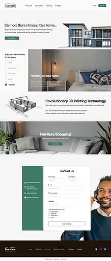
3.05 Final Iterations
After receiving feedback from the client regarding the website design, we proceeded to make the final round of iterations to the HI-Fi Wireframes, based on the client's comments. This time we initiated a call within our Figma file and went through iterations together.
We made some changes to the button's design, and the choice of images, previously used in the Hi-Fi Wireframes.
Throughout the Hi-Fi design stage, I leveraged my expertise in graphic design to guarantee that the team adhered to industry best practices and maintained consistency in the designs.

Example of Home Page UI Iterations
Prototype
With the help of Figma, we created a prototype for the client. I worked on prototyping the Navigation Bar functionality and making sure there are no issues.
To ensure the Prototype's quality, we carefully reviewed it for any small bugs related to functionality and user experience.
Once identified, we resolved them to guarantee a polished and error-free prototype.
4. Developer Handoff
At the final stage, I utilized a Figma plugin known as "Measure" to simplify the process of handing over my design to the development team.
The plugin enabled me to create and share measurements for each design element, making it easier for developers to accurately and efficiently implement the design.
With the use of this plugin, I was able to guarantee that the design will be executed as planned, saving time and decreasing the possibility of errors or misunderstandings during the development phase.


5. Reflection
Throughout the process of redesigning the 3D construction website, I have gained a lot of valuable insights about user experience design.
The initial step was to comprehend the intended audience for the website. In this particular scenario, the primary users were individuals interested in purchasing homes. Conducting a more thorough investigation of the research supplied by the client, we were able to pinpoint their requirements and challenges, which enabled us to create a more intuitive interface.
Secondly, the layout and organization of the website played a crucial role in enhancing the user experience. We made sure to create a clear and intuitive navigation system that allowed users to find the information they were looking for quickly. Additionally, we used a simple and consistent design language to ensure that users could easily understand the purpose and function of each element on the website.
Overall, this project taught me the importance of putting the user at the center of the design process. By understanding their needs and feedback, we were able to create a website that was both aesthetically pleasing and easy to use.